Observer Magazine

Logo, Editorial Design, Print & Publication

Warsaw Business Journal is one of the first English-language weekly business magazines in Poland.

In the early 1990s, our (later) friend Kerth Reyer landed at the Warsaw airport as an expatriate from the US. With a head full of ideas and hopes, in a barren and empty press market, he launched the Warsaw Business Journal project, which had been the only English-language periodical on the Polish market for many years.

Two decades later, after having previously sold off the rights to the title and a numerousf other legal and ownership turmoils, we have met with Kert and the Valkea Media agency, with which we had previously collaborated on the production of the weekly magazine. The idea born at that moment was to prepare a new project – a monthly magazine to continue the legacy of WBJ, to be published on its 20th anniversary.

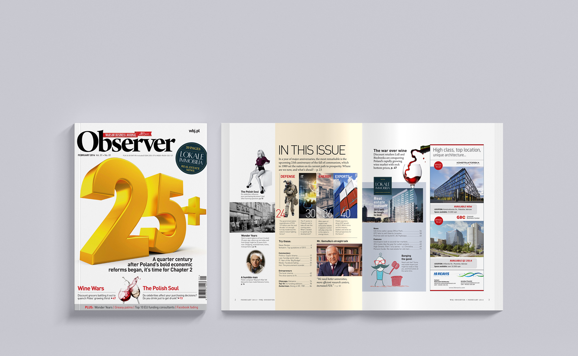
The project in the modern form of a printed and digital magazine was named “Observer”.


Project summary:
Client: Valkea Media
Year: 2017
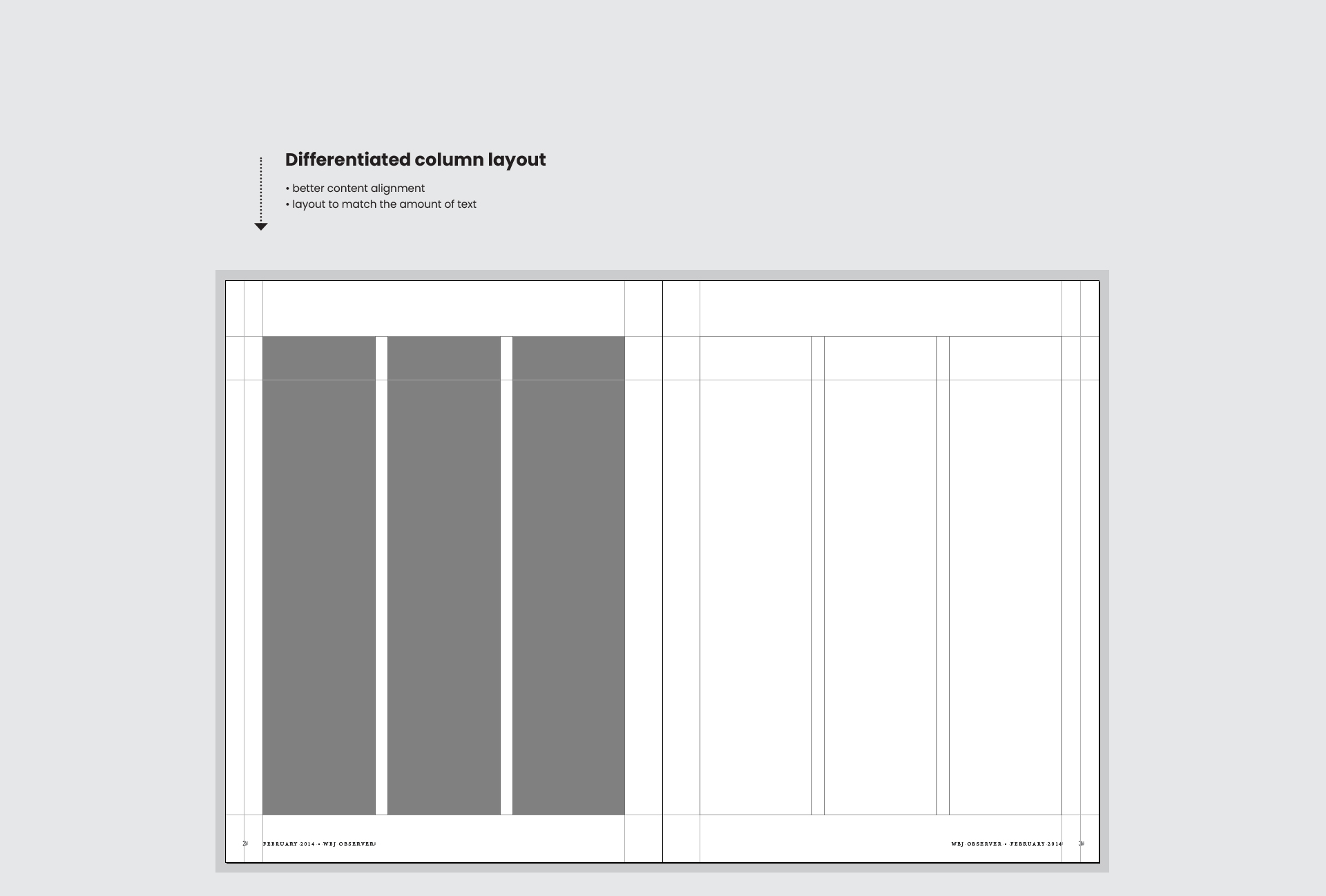
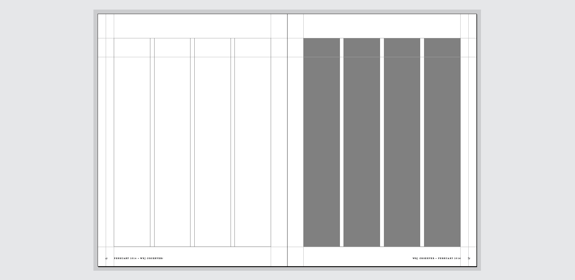
Scope: logo, visual identity, layout
Designers: Łukasz Mazurek, Piotr Wyskok

Cover and inside pages

Magazine layout, including its logo and branding, is among the biggest challenges for a graphic designer.

Publishing graphics combine many smaller design issues into one, holistic whole. An additional challenge lies in working with text and content, which are, after all, the main starhere, and the entire design process must be carried out with the knowledge that the final recipient, the reader, will be reading much longer content than the brief advertising forms.

Readability of the main text, appropriate indication of its most frequent elements, diversification without introduction of unnecessarily, distracting elements, presenting data, graphs – all of this must be clear, easy and encouraging to look at.

Three-column layout
Three-column layout
Three-column layout
Tablet appearance
Cover and inside pages

The title and vignette is the hallmark of any newspaper title.

Recognition of the title guarantees its popularity and retaining regular readers, which is a key element in marketing strategy of business-oriented press.

The assumptions of the creative brief took into account the modern design of the magazine’s mock-up, while keeping in mind the title’s heritage and roots. Therefore, we decided to utilize a classic serif typeface.

The layout was prepared in such a way that it could be adapted to any type, amount and nature of content. We envisioned three column layouts: double and triple for cover stories and commentaries and an additional quadruple layout for short-form content, lists or listings.

Logo
Three-column layout
Four-column layout
Two-column layout
Two-column layout
Two-column layout
Three-column layout

The differing visual presentation of article titles helps to differentiate their subject matter and make it easier for the reader to recognize them.

Therefore, we have applied the rule that the most important articles, cover stories or interviews will have their titles written in a large, highly visible font, using capital letters. The magazine is read in parts, rather than a singular glance. This helps the reader to quickly read only what they have time for at a given moment, leaving less important content for later.

The greatest creative value of the magazine is provided by its writers, that is the journalists. It is ultimately their work that makes the  readers choose a particular title. That’s why we wanted to grant them their rightful recognition by designing footers with author photos. This idea was very well received, both by the authors themselves and the readers.

Further elements, such as the style of statements, quotations and charts, presenting data in a specific and uniformway, all contribute to the Observer magazine’s graphic identity.

We chose two complementary typefaces – Din Pro and Arno Pro. They fulfilled their roles perfectly, with a variety of thicknesses and styles suitable for different applications.

Headlines
Author footers
Quotation style
Chart styles
Typefaces
Printed issue
Printed issue

We prepared the first issue of the magazine comprehensively, including full content composition.

The complete design was then passed on to other DTP specialists, to create subsequent issues of the magazine on its basis. Over time, they have made subtle changes to it, because the magazine is not unlike a living organism that needs to adapt to new situations over time – situations that would be unpredictable when composing the first draft.