Veslog Logistic

Logo, Brand Identity, Marketing & Advertising

Logistics is the process of planning, executing and controlling the efficient and cost-effective flow of materials, supplies, finished goods and relevant information from the point of origin to the point of consumption.

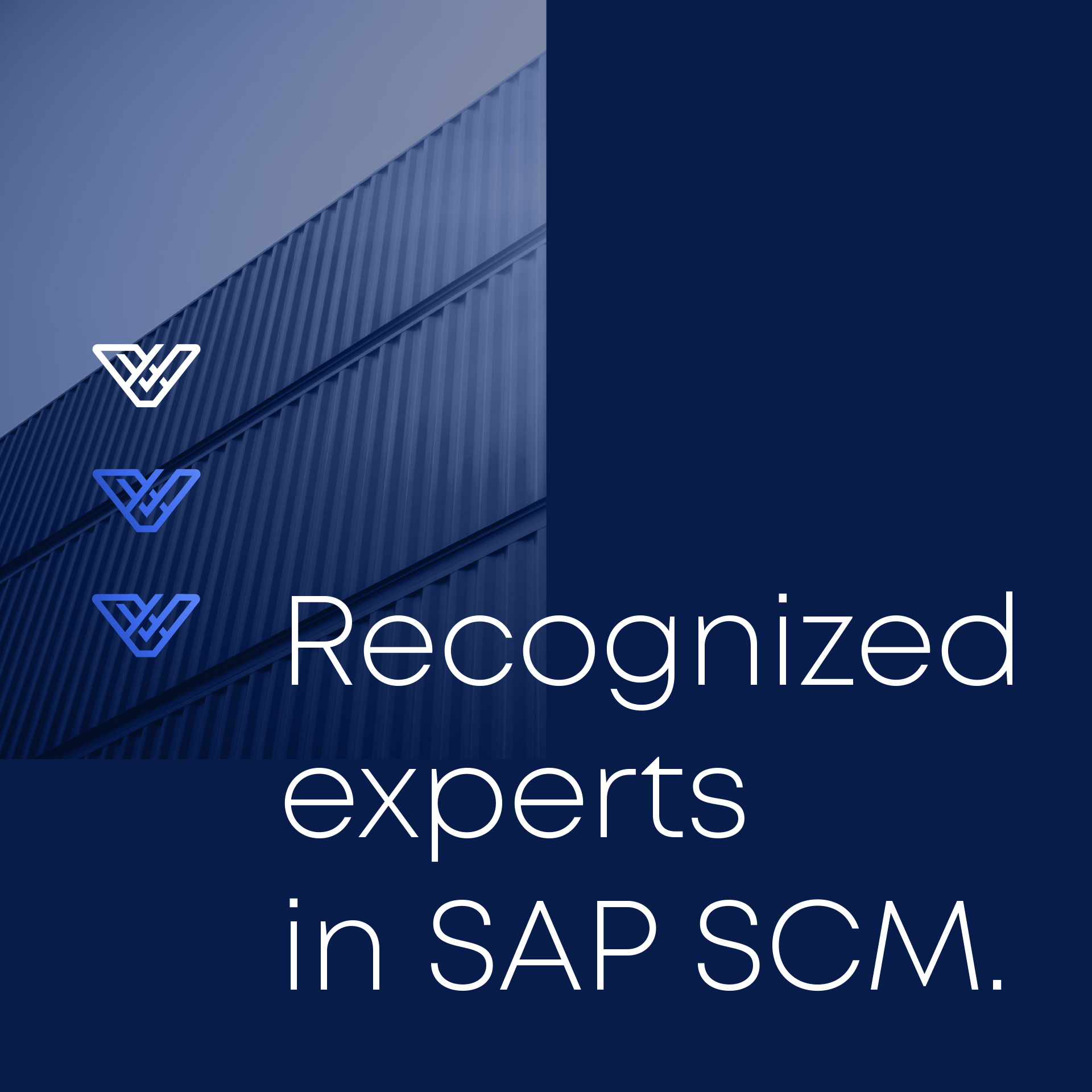
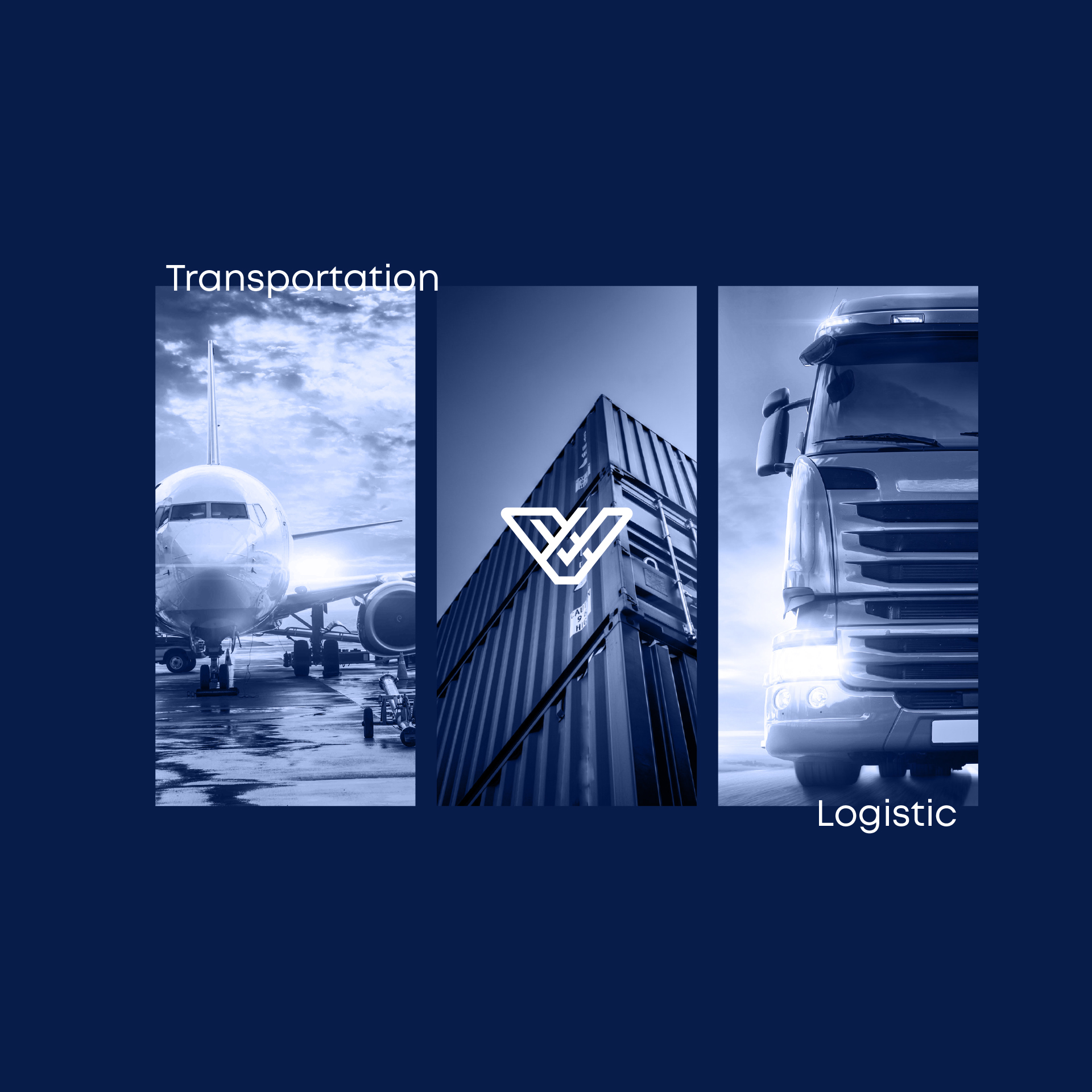
Lomansys Europe is a company that has become a globally recognized SAP Supply Chain Management partner.

Over the past few years, the company has been increasing its presence in various European countries. Changes in the markets and new goals such as sustainable growth and the transition from an IT solutions provider to a global supply chain process provider resulted in a new company strategy that required rebranding, refreshing its image and bringing it in line with current trends.

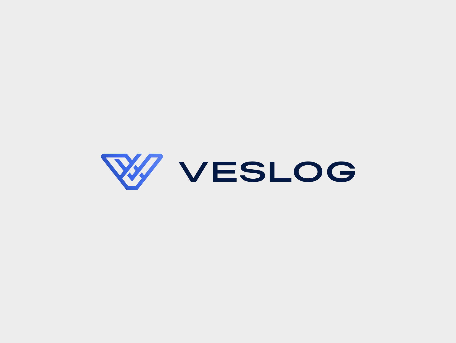
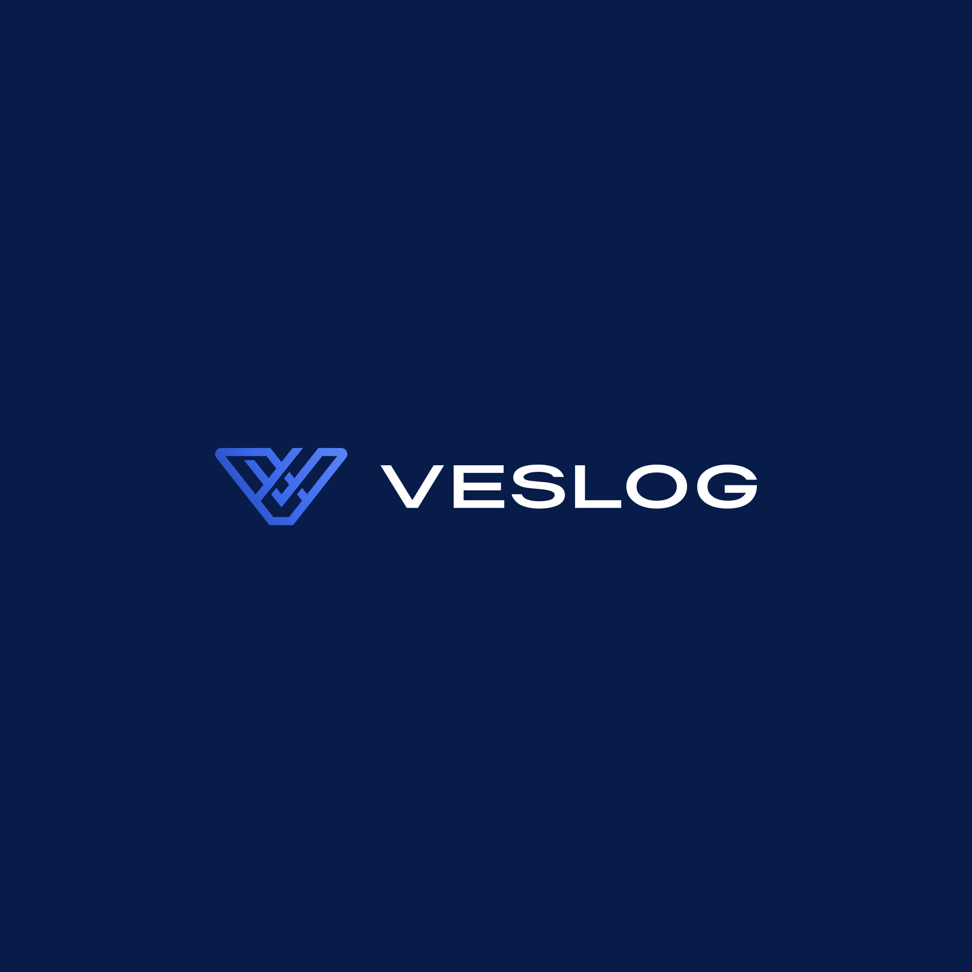
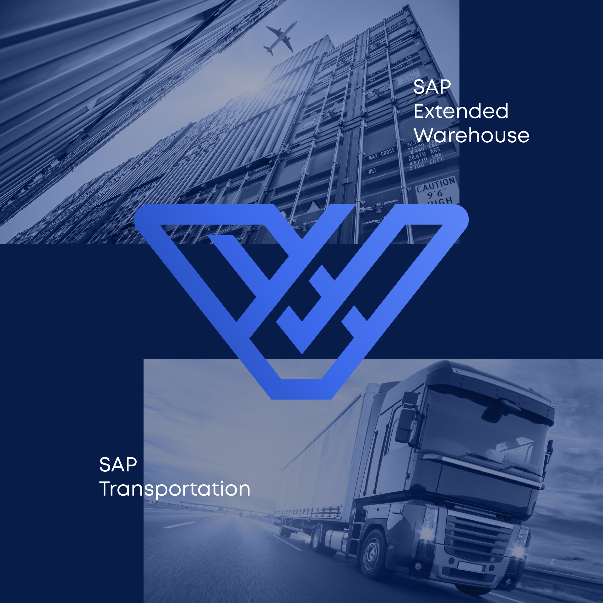
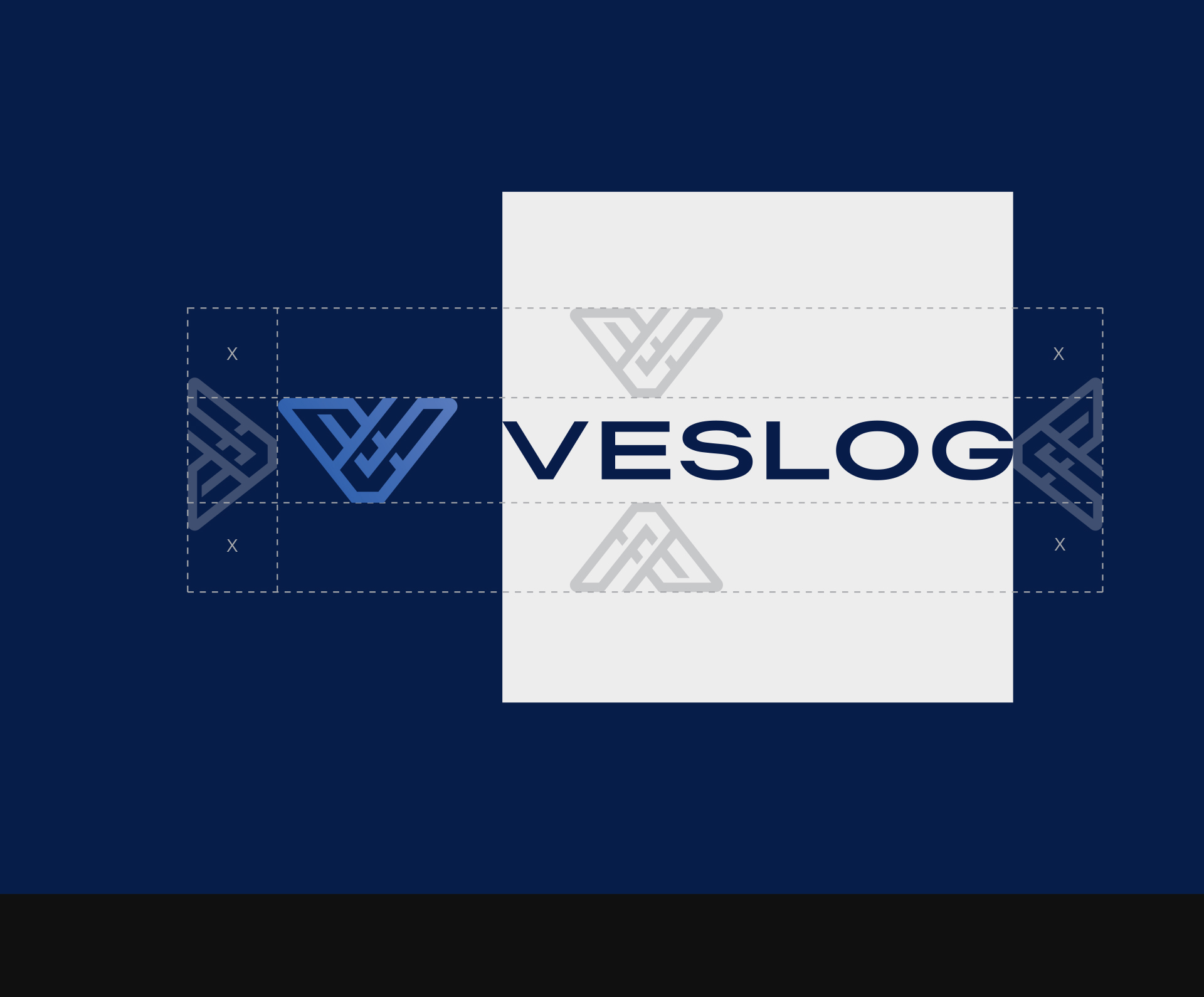
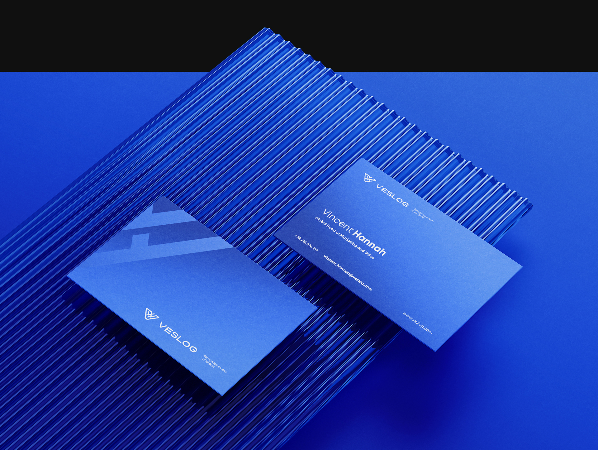
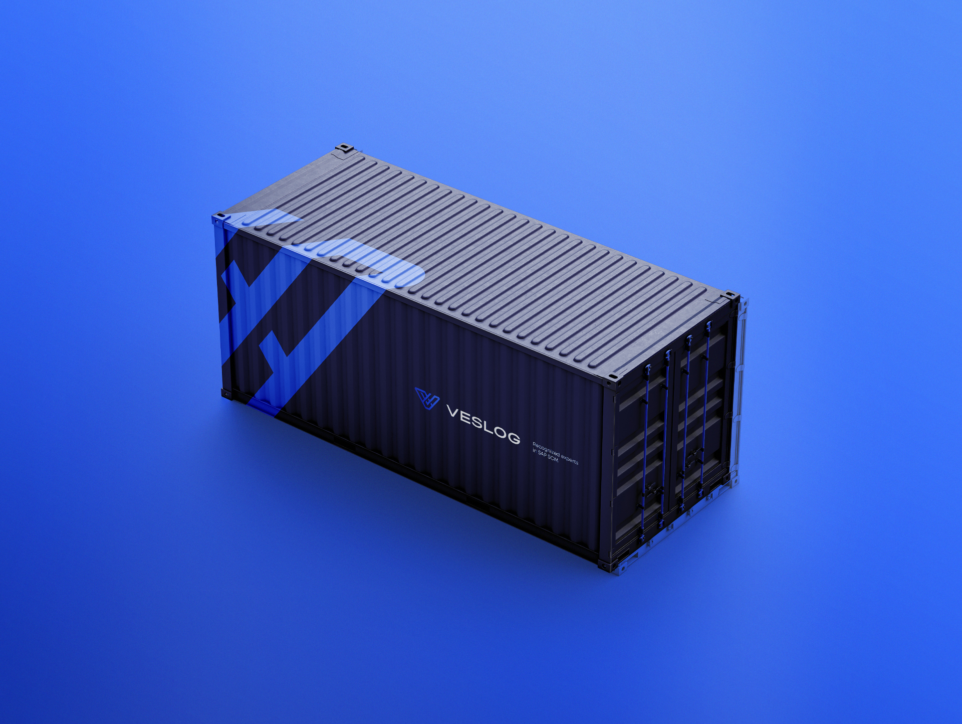
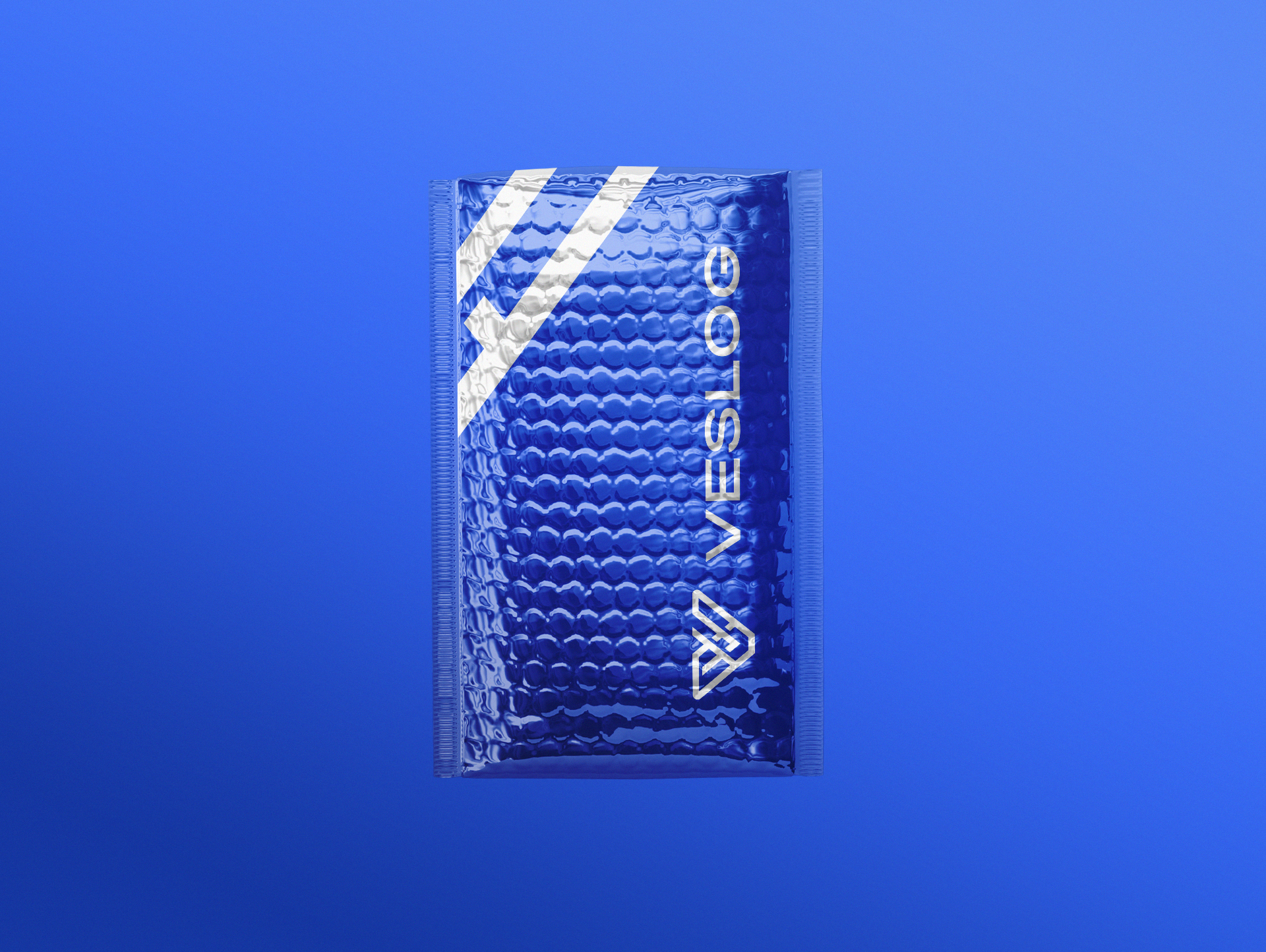
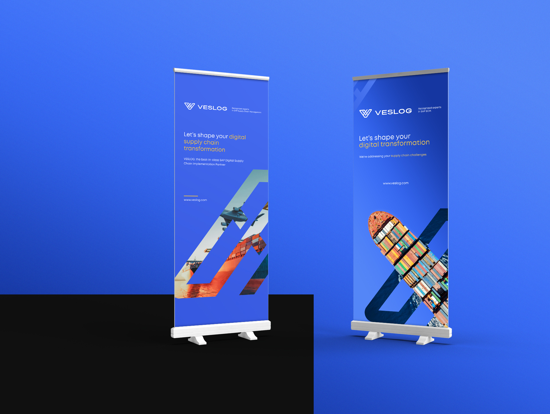
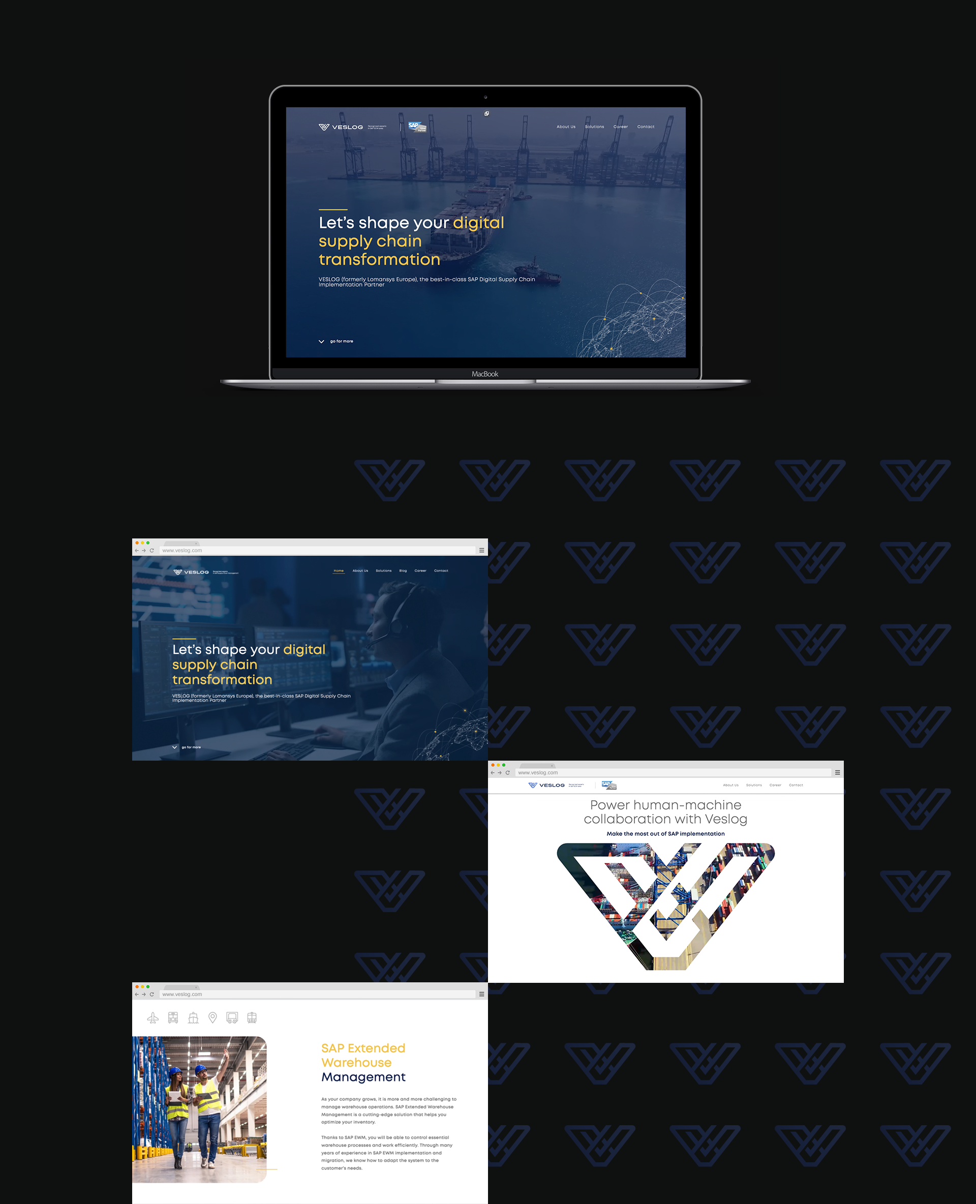
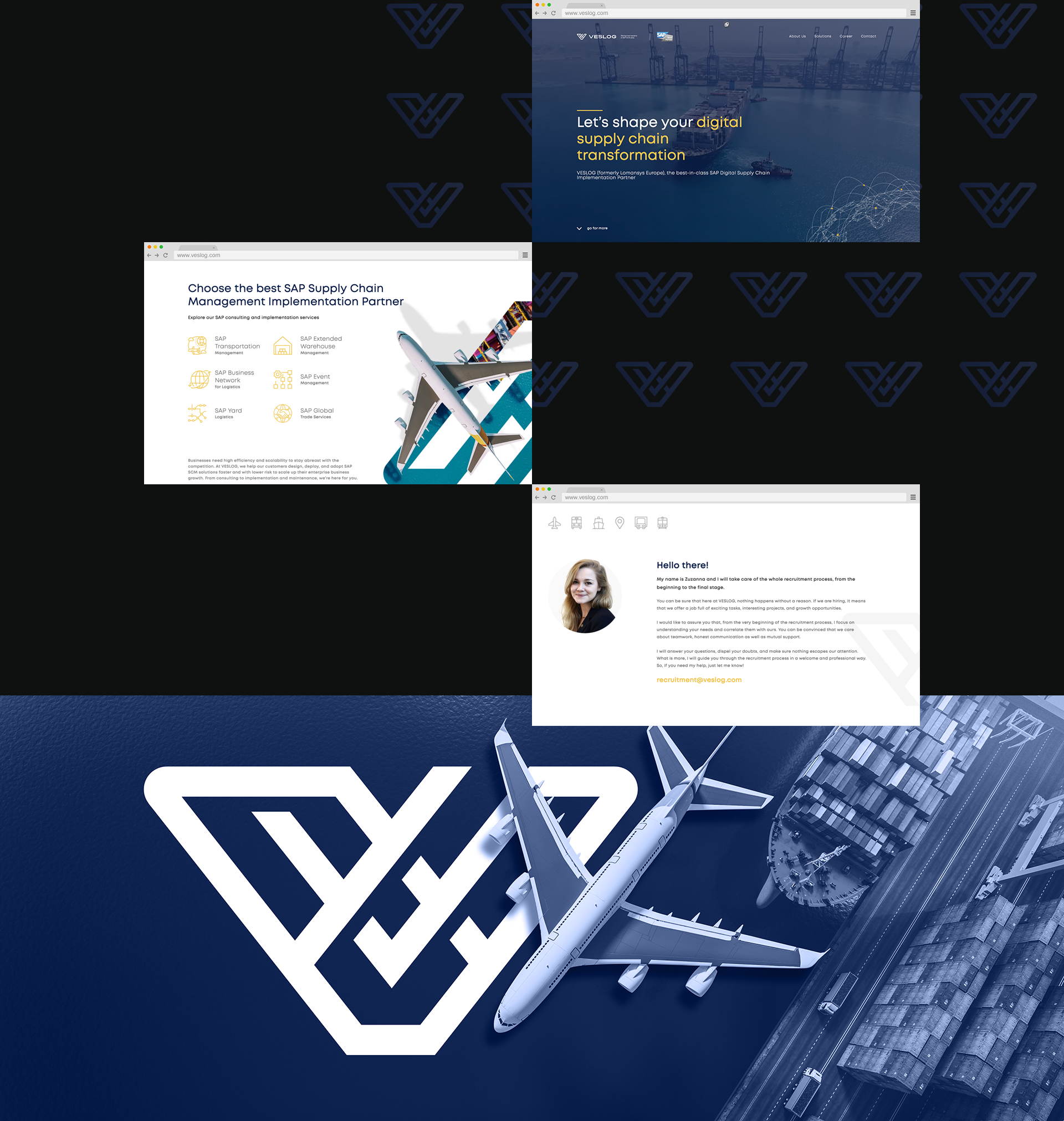
This is how Veslog was born.

Interleo was invited to collaborate on this intriguing project. Our experience and ability to analyze the needs and study current trends in the industry convinced the company’s management to entrust us with the development of a logo and graphic identity, as well as to give the brand a consistent, modern and easy-to-develop graphic language.

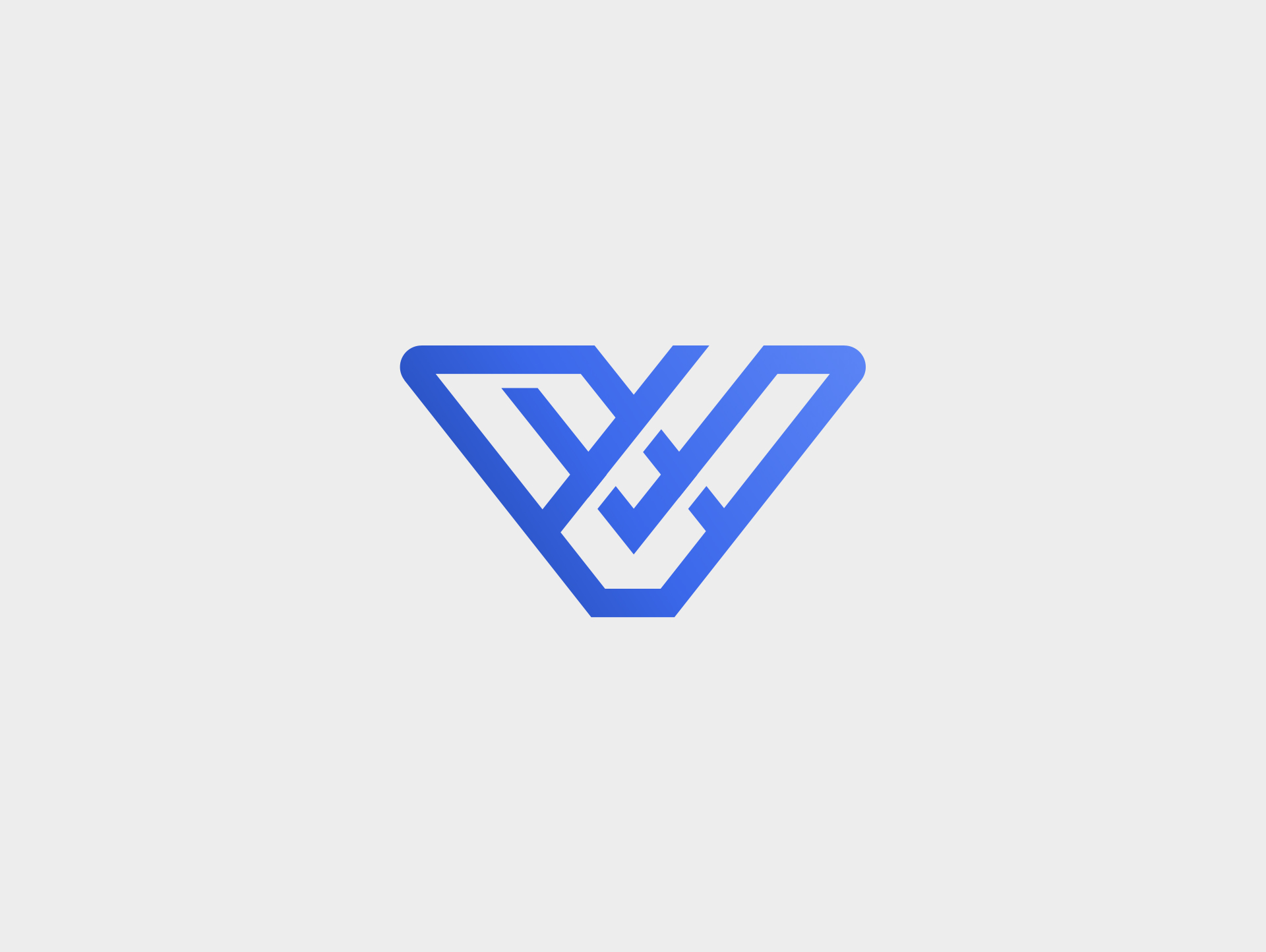
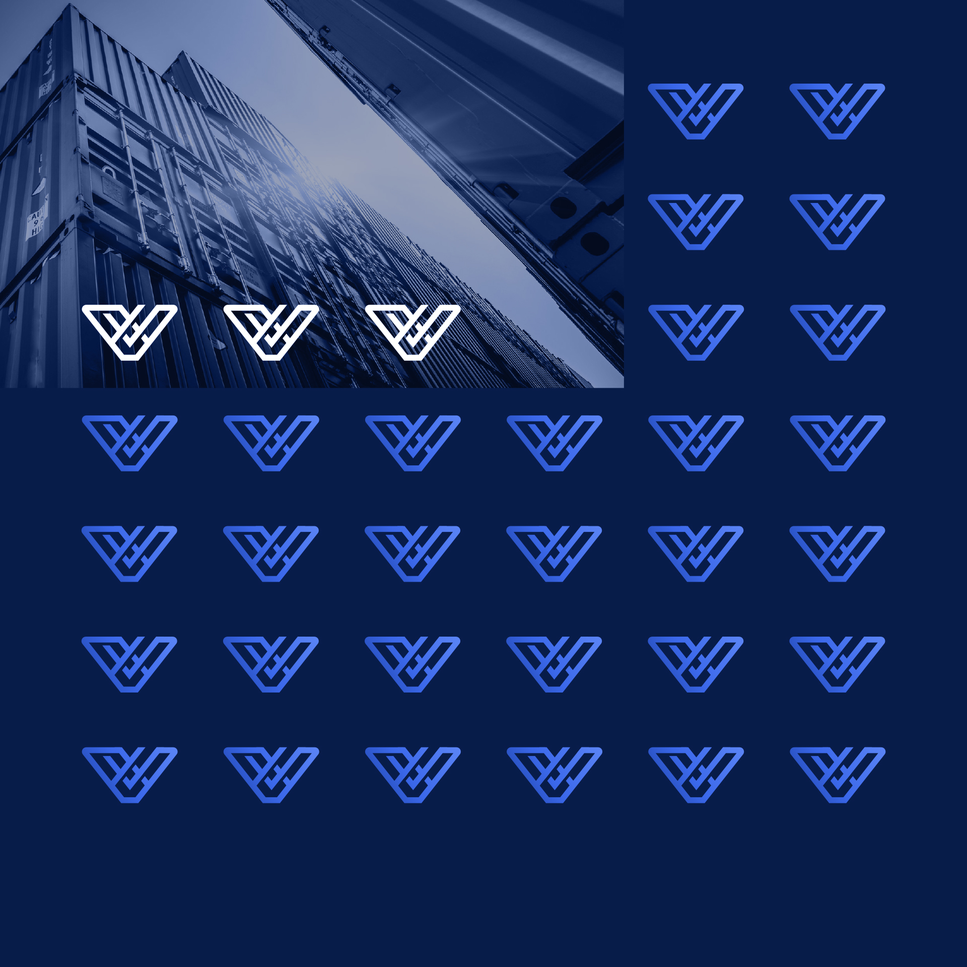
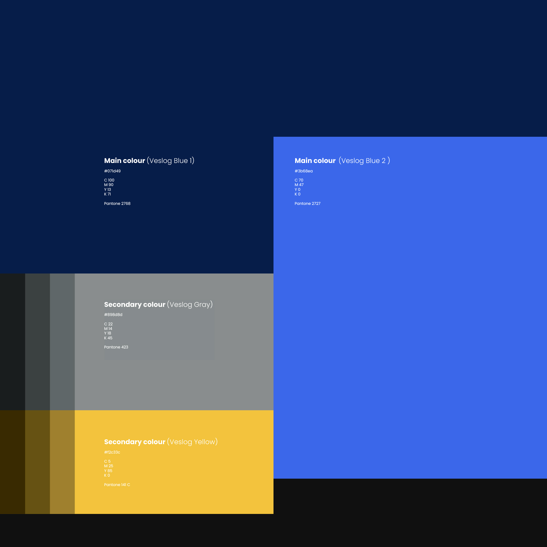
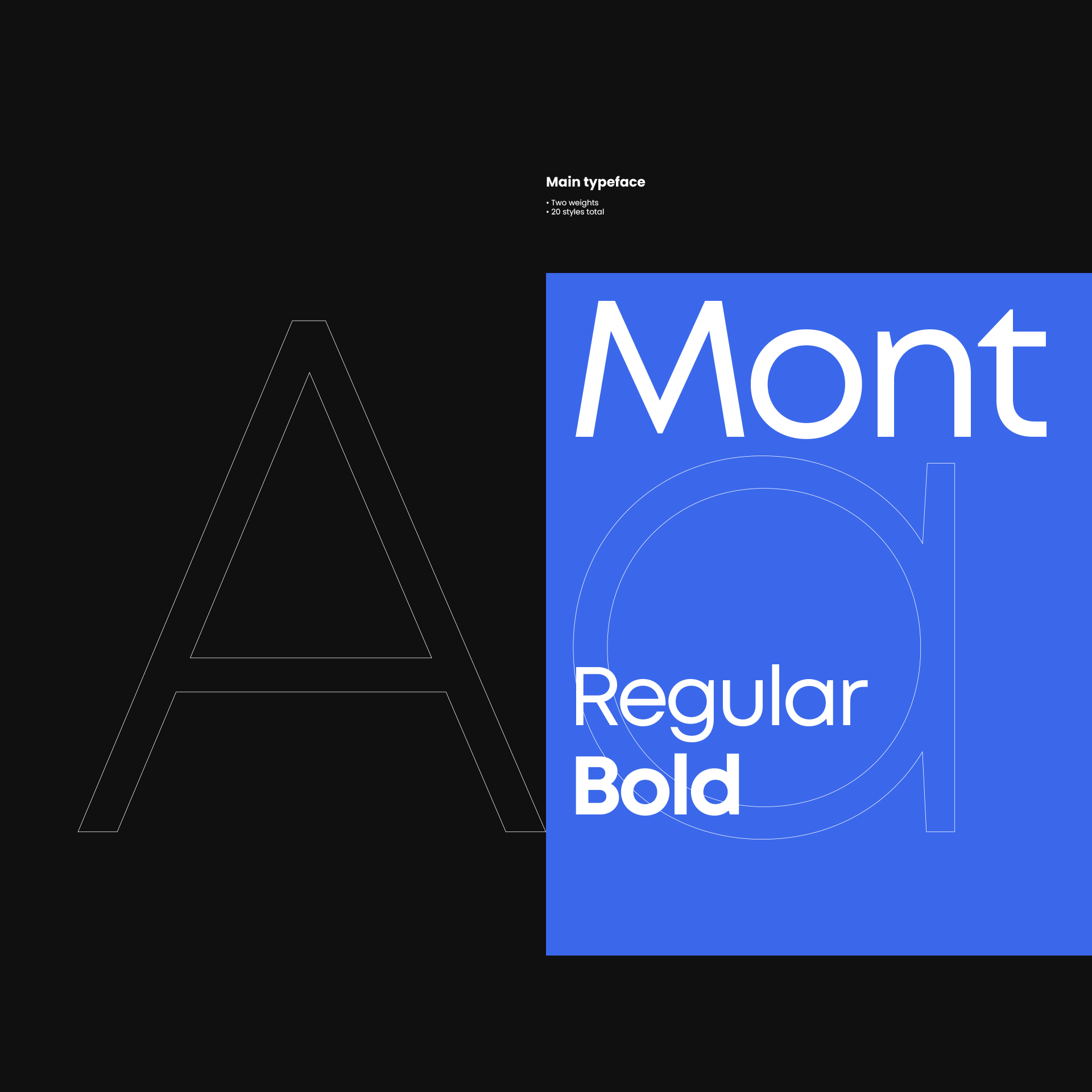
The creative brief and design strategy involved a complete makeover of company’s image. The introduction of a logomark as the logo’s key element, a change in the color palette and a modern typeface – these three aspects formed the foundation of the new strategy.


Project summary:
Client: Veslog
Year: 2022
Scope: logo, brand identity, marketing materials

Art Director: Krystian Świtaj
Designers: Krystian Świtaj, Klaudia Sybilska, Marcelina Cacko

Logomark
Logo
Logo

A logomark built of intersecting lines depicting the letter “V”.

The complex logomark reflecting the complicated, interdependent and intersecting processes, was a key element to be developed.

Together with the name, written in a modern, slightly flattened typeface, it gives the impression of a solid and stable symbol, hinting at the complexity of processes in the logistics industry.

Logomark
Logo
Logomark
Logomark

Logistics, transportation, warehousing and storage – these concepts define the industry in which Veslog provides its services.

The company’s ambition is to provide services to its customers at a level  previously considered unachievable. Its clients include both large entities and smaller companies that can rely on a strong team of professionals motivated and proud to guarantee excellent service and continuous support to companies of all sizes and industry segments – wherever it is needed and required.

Air transportation, land and sea transportation, warehousing and storage – all of these elements make up the global logistics. Minimizing the cost, possible losses and transportation time of a given commodity, while maintaining the appropriate level and quality of services offered.

This area affects the creation of demand for a given product, and thus, in a way, the preferences of end customers – this is a big responsibility, the awareness of which has guided us as well during our work.

Logomark
Logomark
Logomark
Logomark
Logomark

Company colors, is the second aspect of an identity, after the distinctive logo, that affects brand recognition.

Colors evoke associations. The psychology of color concerns emotions. Colors can evoke pleasure, happiness, anxiety and energy. In fact, color is more than an optical phenomenon. This means that all colors have their own meanings. They all have a special effect on our minds and how we perceive a product or service.

We have decided to keep a subdued color scheme from the blue palette as the primary one. It suggests a sense of confidence and trust in the brand. The blue improves productivity, isn’t distracting and is the color of harmony.

The blue palette is complemented by gray colors and yellow is present to bring out accents. Blue and yellow are complementary colors, lying opposite each other on the color wheel. Juxtaposing colors according to this rule is ideal when searching for a color to accentuate key elements.

Brand colors

Another element of Veslog’s graphic identity is the typeface.

We have proposed the Mont typeface – it is a geometric sans-serif typeface consisting of 10 weights from Hairline to Black with matching italics.

Mont’s balanced characteristics with unique details such as the pointed “t” and distinctive x-height make it ideal for strong headlines, but also suitable for long text.

The authors of the typeface are Mirela Belova and Svetoslav Simov.

Brand typography
Logo clear space

All elements and components of the design were, after final approvals, testing and implementation, carefully documented and collected in a brand book.

In this case, we limited ourselves to describing only the basic principles of the logo, colors and typography, in a short, easy-to-read form.

The Veslog identity has a lot of potential for development, and this was the strategy adopted by the client.

We agreed that at this stage we do not want to impose further guidelines. We want to see how the brand with the new name and logo will evolve, how the new mark will perform and what conclusions will be drawn. This will allow us to think more deeply about the next steps and the development of more detailed rules for subsequent studies and materials.

Brand book
Brand book

The basic identity elements needed at this stage of the brand’s development were primarily printed materials, such as business cards, envelopes and packaging.

We have proposed a compositionally consistent design for these materials. We used the basic elements of the design, taking into account the paper on which they would be printed. Business cards made of thick, fine paper, produced ecologically, just like the envelopes or folders.

Such material adds a unique feel to each graphic.

In addition, we have implemented the conceptual design of container signage, a very distinctive element for the logistics industry. For marketing purposes, we also made designs for roll-ups – a solution which might sometimes be considered archaic in these digital times, but continually proving very effective and necessary. This was a clear request from the marketing department, and we share their belief that all solutions have their place and role to play.

Business cards
Container branding
Stationery
Packaging
Pull up banner

Veslog’s new identity was key to the new design of the company’s website.

Since it was not our part to create the site’s design, all of the concepts and principles we had proposed became a starting point for web designers. It was an interesting opportunity for cooperation, resulting in the final website, which works perfectly and fulfills all required functions.

The design and implementation of the site were both handled by Wise People – a team of enthusiasts who provide products of the highest quality. Working with them was a very interesting experience for us, but what was most important in the end was the customer’s satisfaction with the final product. We are always open to such cooperation, where mutual competencies do not interfere with each other, but rather complement each other for a singular purpose – creation of an excellent final product that fulfills its function.

Website
Website